The Collaboration
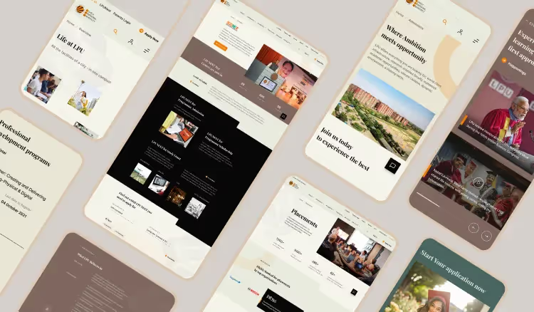
Lovely Professional University (LPU), a leading private institution in India, partnered with us to strengthen its global reach. Focused on providing a well-rounded education, LPU entrusted us to redesign their website, highlighting their international collaborations and attracting students from diverse backgrounds worldwide. The primary focus of the redesign was to streamline a vast amount of content into easily digestible and accessible bits, catering to the needs and wants of various different user personas along the way.
Problem Definition

LPU's website faced challenges with poor navigation, difficult access to key information, and an outdated representation of the university's core values.
.avif)

The process we followed
- Discovery Workshop & Research
- Key Page Wireframes
- Secondary Page Wireframes
- Visual Designs
- Prototyping
- Design System
- Frontend Development
Opportunities discovered
the EXPERIENCE we created
.avif)
.avif)
.avif)
.avif)
No items found.


The color system represents growth, innovation, and forward-thinking, aligning with the university's commitment to academic excellence and modern education. It helps reduce user's cognitive load and fosters a welcoming, positive user experience.
.avif)

.avif)


.avif)
No items found.
No items found.
No items found.
No items found.
No items found.
No items found.
.avif)
.avif)
The IMPACT
No items found.
Our CLIENTS
ARE SAYING...
No items found.


.avif)
.avif)


.avif)
.avif)